
The Power of Website Navigation Design:
How It Boosts User Engagement and Experience
Website Navigation Design is one of the most crucial elements of web development. A well-crafted navigation system not only makes your site easy to use but also draws users into a more interactive, engaging experience. But what exactly does this mean for your website and, more importantly, for your visitors? Let’s look at the different types of website navigation and how each one can be used to create a user-friendly and interesting online environment.
Full-Screen Navigation: Immersive and Focused
Imagine visiting a website where the entire screen is dedicated to navigation. It immediately captures your attention, drawing you into the content without distractions. This is the beauty of full-screen navigation. This style works particularly well for creative or single-page websites, where the focus is on making a strong visual impact without overwhelming users with too many choices.
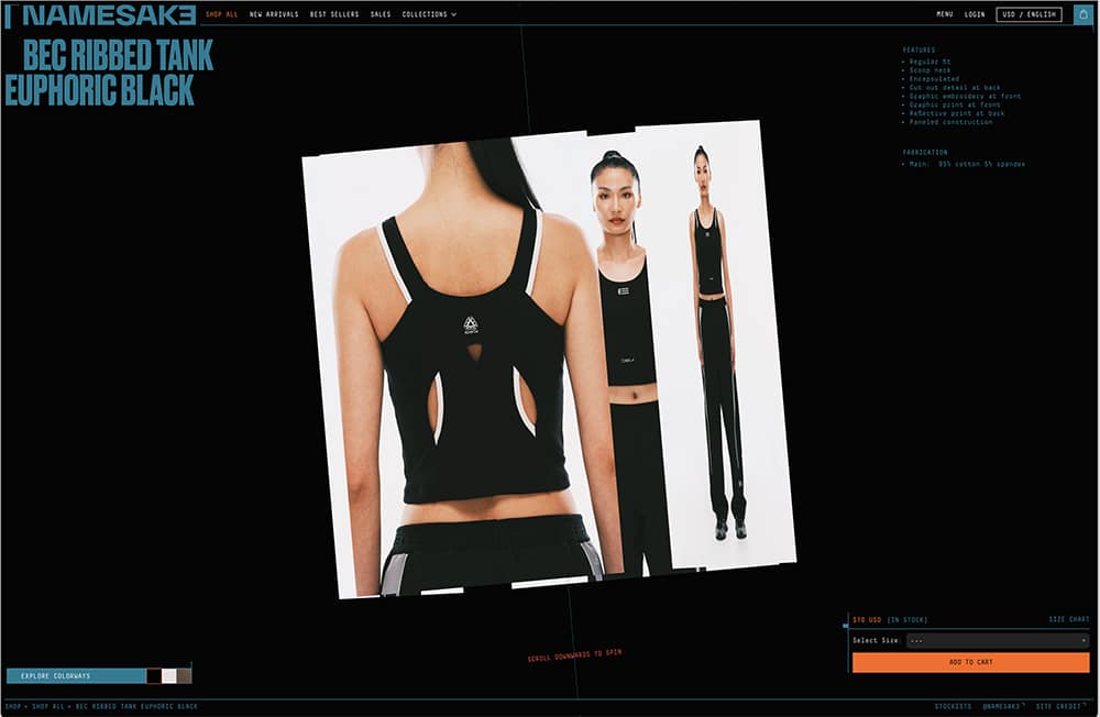
For example, Namesak3, an eCommerce platform, uses a full-screen interactive menu that feels futuristic and immersive. By giving users fewer distractions, they are more likely to engage with the content, exploring deeper into the site, which ultimately increases their time spent on the page.
In-Image Navigation: Seamless and Visual
Some of the most visually compelling websites incorporate in-image navigation. Instead of relying on a traditional menu, navigation is built directly into the visuals. For instance, hovering over an image might reveal a hidden menu or navigation link. This approach keeps the user focused on the visual storytelling aspect of the site, enhancing their overall experience.
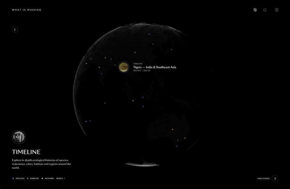
The “What Is Missing” website demonstrates this well by integrating visual cues and hover effects into its images. Users navigate the site intuitively, following visual clues that make the browsing experience feel more fluid and engaging.
Scroll-Based Navigation: Keeping the Flow Going
One of the most popular forms of modern navigation is scroll-based navigation. Rather than relying on users to click through menus or pages, scrolling allows the content to unfold seamlessly as they move down the page. This style is particularly effective for storytelling websites or long-form content, providing a continuous, engaging experience.
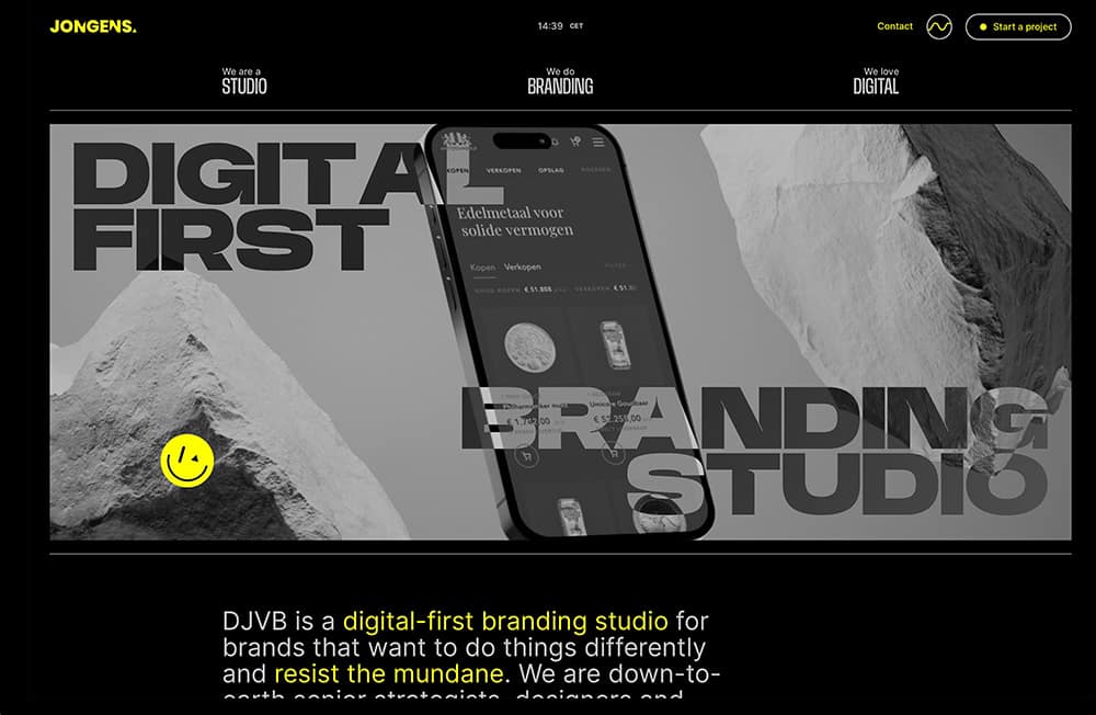
Consider the De Jongens van Boven website, where the scroll-based navigation gradually reveals new content as users move through the site. Text, images, and other elements appear and disappear in a choreographed manner, timed with the user’s scrolling action. This dynamic content reveal adds an element of discovery and engagement to the browsing experience. The website also incorporates subtle visual cues to guide users through the scrolling experience. These may include animated arrows or other design elements that suggest the direction of navigation and indicate the presence of additional content
Animated Navigation: Interactive and Fun
Animation in website navigation is a great way to inject life into your design. Whether it’s through hover animations, sliding menus, or fun transitions, animations provide instant feedback that grabs users’ attention. They also make navigation more interactive by responding to the user’s actions.
The goal here is to strike a balance: enough animation to keep users engaged, but not so much that it distracts from the content. When done right, animated navigation offers a memorable user experience, making the site feel lively and responsive.
Hamburger Menus with Visual Previews: Minimalist and Informative
We’ve all seen the hamburger menu—those three stacked lines often found in the corner of a webpage, hiding additional navigation options. While typically used for mobile sites, hamburger menus are increasingly being used on desktop designs to maintain a clean, minimalist interface. But what makes this type of navigation more engaging is when it’s paired with visual previews.
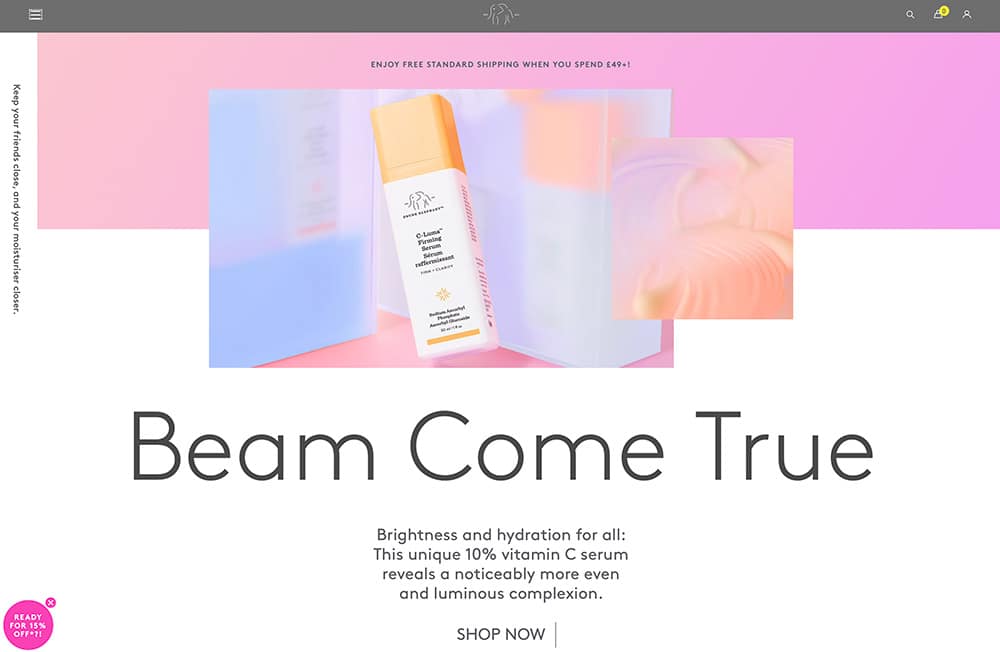
Drunk Elephant’s website, for example, takes the traditional hamburger menu and enhances it by showing product previews when users hover over the categories. This not only makes the site more visually appealing but also helps users quickly decide where to go, making their navigation choices easier and more informed.
Infinite Scroll with Looping Navigation: Continuous and Engaging
For content-rich websites, infinite scroll combined with looping navigation is an excellent choice. This navigation type allows users to continue scrolling through endless content without hitting a stopping point. Websites that use this design make it easy for users to stay engaged with the content, as new items continually load as they scroll.
This type of navigation is perfect for blogs, portfolios, or eCommerce sites where you want to keep users on the page as long as possible, allowing them to discover more content effortlessly. Looping navigation enhances this experience further, giving users the sense that they can explore the site in a never-ending loop, which keeps them more engaged.
Minimalist Navigation with Expandable Options: Clean and Functional
If you’re aiming for a clutter-free design, minimalist navigation with expandable options could be the right choice. With this design, the menu remains minimal until a user interacts with it, such as hovering or clicking to reveal additional choices. This is an excellent solution for sites that want to keep their main navigation clean without sacrificing functionality.
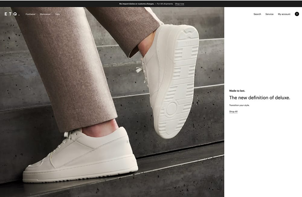
ETQ’s website uses this approach effectively by expanding the navigation bar on hover, showing more categories as needed. This design allows users to focus on the content at hand without distractions, yet still have easy access to additional options when necessary.
Why Website Navigation Design Matters
Each of these navigation styles offers unique benefits depending on your website’s goals and audience. The key takeaway is that website navigation design isn’t just about guiding users from point A to point B; it’s about creating a fluid, enjoyable experience that keeps them engaged with your content. A well-designed navigation system can improve usability, reduce bounce rates, increase time on site, and ultimately help drive conversions.
Whether you’re designing a complex eCommerce site or a sleek portfolio, choosing the right navigation style can be the difference between a frustrated visitor and a loyal customer. By carefully considering the best navigation approach for your site, you’ll enhance usability, improve user satisfaction, and boost your SEO, making your site more discoverable and valuable in the digital marketplace.


0 Comments